

Font
Platform
Modern, veelzijdig en krachtig. Platform combineert strakke elegantie met een creatieve randje, perfect voor alles van koppen tot kleine lettertypes. Een lettertype dat je boodschap helder maakt en je ontwerp onderscheidend.
Heading sizes
Heading 3XL
Platform / 50–58 / 700 Bold / Default case / 3 lh / 1 letter spacing
Heading 2XL
Platform / 37–43 / 700 Bold / Default case / 2 lh / 1 letter spacing
Heading XL
Platform / 28–32 / 700 Bold / Default case / 1 lh / 1 letter spacing
Heading L
Platform / 21–24 / 700 Bold / Default case / 1 lh / 1 letter spacing
M - Body
Open Sans / 16–16 / 400 Normal / Default case / 1.1 lh / 0 letter spacing
Small
Open Sans / 13–15 / 400 Normal / Default case / 0.8 lh / 1 letter spacing
Extra small
Open Sans / 11–13 / 400 Normal / Default case / 0.7 lh / 1 letter spacing
Text examples
The quick brown fox jumps over the lazy dog The quick brown fox jumps over the lazy dog
The quick brown fox jumps over the lazy dog The quick brown fox jumps over the lazy dog
The quick brown fox jumps over the lazy dog The quick brown fox jumps over the lazy dog
The quick brown fox jumps over the lazy dog The quick brown fox jumps over the lazy dog
The quick brown fox jumps over the lazy dog The quick brown fox jumps over the lazy dog The quick brown fox jumps over the lazy dog The quick brown fox jumps over the lazy dog
The quick brown fox jumps over the lazy dog The quick brown fox jumps over the lazy dog The quick brown fox jumps over the lazy dog The quick brown fox jumps over the lazy dog
The quick brown fox jumps over the lazy dog The quick brown fox jumps over the lazy dog The quick brown fox jumps over the lazy dog The quick brown fox jumps over the lazy dog
Lorem ipsum dolor sit amet, consectetur adipiscing elit. Sed do eiusmod tempor incididunt ut labore et dolore magna aliqua. Ut enim ad minim veniam, quis nostrud exercitation ullamco laboris nisi ut aliquip ex ea commodo consequat. Duis aute irure dolor in reprehenderit in voluptate velit esse cillum dolore eu fugiat nulla pariatur. Excepteur sint occaecat cupidatat non proident, sunt in culpa qui officia deserunt mollit anim id est laborum.
Etiam accumsan urna a mauris dapibus, nec aliquet nunc convallis. Phasellus eget justo et libero ultrices posuere. Cras euismod, arcu nec congue convallis, ipsum nunc cursus nibh, vel condimentum sapien orci non libero. Integer ullamcorper felis sit amet felis placerat, eu convallis lorem iaculis.
Fusce at nisi arcu. Quisque sed dolor nec dui scelerisque dapibus. Sed at purus at sem aliquet luctus. Sed non massa sit amet sapien porttitor ornare. Vivamus pretium, tortor at tempus ullamcorper, diam ligula lobortis quam, at scelerisque libero lectus ut risus.
Donec et urna vel risus feugiat pharetra. Proin id lacus vitae velit accumsan venenatis. Aenean non mi vel nisi lacinia maximus. Duis efficitur, sapien quis bibendum auctor, lectus risus feugiat sapien, ac pulvinar orci est a arcu. Integer id augue vitae urna tristique tempus.
Vestibulum ante ipsum primis in faucibus orci luctus et ultrices posuere cubilia curae; Pellentesque sodales, velit nec euismod scelerisque, lectus est interdum eros, sit amet bibendum eros sapien in magna. Quisque suscipit ligula eu turpis dignissim, a eleifend ipsum cursus.
Responsive typography
This is a step-by-step, copy-once-reuse-forever guide that reproduces exactly the system we built.
All headers, except body test, is made fluid with Clamp functionality.
Decisions we locked
- Viewport range: 375px → 1440px
- Base text: Body = 16px fixed (no scaling)
Scales:
- Desktop: Perfect Routh 1.333
- Mobile: Minor Third 1.2
Units:
- Line-height unitless, in elementor lh
- Viewport math in px/vw
Size ladder (mobile → desktop)
Use the ratios to compute mobile; apply ×1.15 for desktop. Round to whole px.
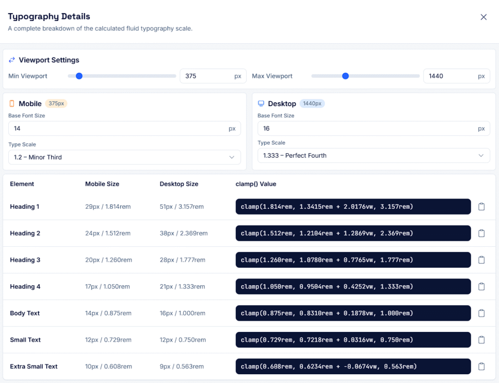
If you ever change the base or the ratios, recompute the Mobile column first, then multiply by 1.15 for Desktop.
Build Elementor-friendly clamps
We use slope–intercept:
clamp(minPx, Apx + Bvw, maxPx)
How to compute A and B for any (minPx → maxPx):
- Let Wmin = 375, Wmax = 1440, ΔW = 1065
- B (px per vw) = (maxPx − minPx) × 100 / ΔW
- A (px) = minPx − B × (Wmin / 100) = minPx − B × 3.75
Clamps that match the ladder exactly
Small text
					/* XS: 11 → 13 px */
clamp(11px, 10.295775px + 0.187793vw, 13px);

/* S: 13 → 15 px */
clamp(13px, 12.295775px + 0.187793vw, 15px);

/* Body: fixed */
16px;
Headings
					/* H4: 21 → 24 px */
clamp(21px, 19.943662px + 0.281690vw, 24px);

/* H3: 28 → 32 px */
clamp(28px, 26.591549px + 0.375587vw, 32px);

/* H2: 37 → 43 px */
clamp(37px, 34.887324px + 0.563380vw, 43px);

/* H1: 50 → 58 px */
clamp(50px, 47.183099px + 0.751174vw, 58px);
Why px (not rem)? Elementor may not hit your exact px targets if 1rem ≠ 16px. Using px guarantees precision at 375px and 1440px and a perfect linear interpolation in between.
Quick verification method
Examples sanity check:
H2 (37→43 px)
at 375 → 37.00 px
at 768 → 39.21 px
at 1024 → 40.66 px
at 1440 → 43.00 px
H1 (50→58 px)
at 375 → 50.00 px
at 768 → 52.95 px
at 1024 → 54.88 px
at 1440 → 58.00 px
Line-height, measure, spacing
					/* ----------------------------------------------------
   TYPOGRAPHY SPACING SETTINGS
   Roles: .h1–.h4, .s, .xs, .body
   - Only contains line-height (unitless 'lh') and letter-spacing
   - Line-height values are based on your updated settings
   - Letter-spacing in px (positive = looser, negative = tighter)
   - Font sizes are defined elsewhere (Global Fonts / clamp)
---------------------------------------------------- */

.h1   { line-height: 3;   letter-spacing: 1; }
.h2   { line-height: 2;   letter-spacing: 1; }
.h3   { line-height: 1.5; letter-spacing: 1; }
.h4   { line-height: 1.2; letter-spacing: 1; }
.s    { line-height: 0.8; letter-spacing: 1; }
.xs   { line-height: 0.7; letter-spacing: 1; }
.body { line-height: 1.1; letter-spacing: 0; }